







Executive Overview
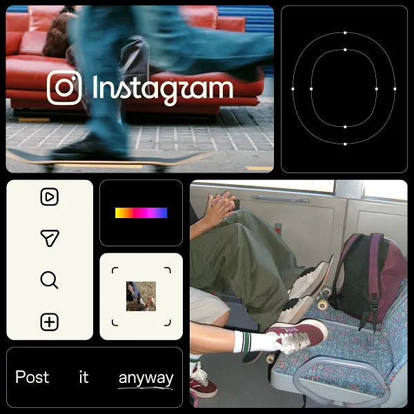
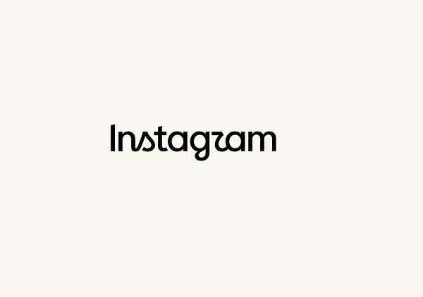
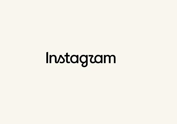
In a move that signals a deliberate effort to modernize its visual identity, Meta-owned photo and video-sharing juggernaut Instagram has rolled out its first major branding overhaul in more than ten years. Spearheaded by platform Chief Adam Mosseri, the comprehensive redesign introduces an updated wordmark, refined typography, new iconography, and a completely overhauled "brand system" designed to inject a sense of contemporary sharpness into the application.
While corporate design teams often view such updates as essential milestones to keep aging platforms visually competitive in a fast-paced digital ecosystem, the user base has historically—and predictably—greeted the change with a mixture of apathy, confusion, and vocal criticism. Within hours of Mosseri taking to both Instagram and Threads to debut the new look, the announcement posts accumulated thousands of replies. Users were quick to dissect the typographical nuances of the new wordmark, with particular ire directed at the stylized lowercase "r," which many claimed bore an unfortunate resemblance to the letter "z."
Beyond the aesthetic grievances, the rollout has reignited longstanding frustrations regarding the platform’s algorithmic feed sorting, commercial bloat, and prioritization of short-form video over traditional chronological sharing. Yet, beneath the immediate turbulence of social media commentary lies a deeper strategic question: Is this visual refresh merely a cosmetic touch-up, or does it herald a broader structural shift in how Instagram intends to position itself against fierce competitors like TikTok and YouTube? For digital marketers, graphic designers, and everyday users alike, this rebrand serves as an important reminder of the delicate balance tech giants must strike between innovation and brand heritage. This article explores the anatomy of Instagram’s new visual identity, the mechanics of the backlash, and what this evolution signals for the future of the platform.
Detailed Chronology of the Rebrand
The journey toward Instagram’s current visual identity is rooted in a fascinating history of rapid expansion and strategic corporate repositioning. Understanding the significance of this latest update requires looking back at how the platform’s branding has evolved since its inception in 2010.
The Origin and the 2016 Paradigm Shift
When Kevin Systrom and Mike Krieger launched Instagram in October 2010, the app’s aesthetic was defined by the skeuomorphic era of digital design. The original app icon—a detailed, retro-style instant camera complete with a rainbow stripe—reflected the platform’s core utility as a place to apply vintage-inspired filters to square photographs. The original wordmark featured a handwritten, cursive script that embodied a boutique, artisanal feel.
As the platform scaled to hundreds of millions of users, that vintage aesthetic began to feel increasingly out of place alongside sleek, minimalist operating system interfaces. In May 2016, Instagram executed one of the most talked-about rebrandings in tech history. Spearheaded by then-VP of Design Ian Spalter, the company replaced the skeuomorphic camera with a vibrant, gradient-backed glyph and transitioned the wordmark to a cleaner, yet still distinct, type treatment. At the time, the 2016 redesign sparked fierce public outcry; users lamented the loss of the nostalgic brown camera icon, arguing that the new purple-to-orange gradient lacked soul. However, within weeks, the outrage subsided, and the gradient became universally recognized as an iconic symbol of modern mobile culture.
The Decade of Stagnation and the Need for Change
For the ten years following the 2016 overhaul, Instagram’s core visual branding remained largely static. While the app underwent monumental functional transformations—introducing Instagram Stories in 2016, Reels in 2020, and shifting aggressively toward algorithmic video recommendations—its text-based wordmark and overarching brand system remained largely unchanged.
By the mid-2020s, design leads at Meta recognized that the aging wordmark was beginning to look dated when rendered across high-resolution displays, ultra-wide desktop monitors, and varying marketing collateral. Furthermore, as Meta unified its corporate design language across Facebook, WhatsApp, and the newly launched text-based network Threads, Instagram’s typography needed a cohesive framework to bind these ecosystems together.
The October Rollout
In late October, Adam Mosseri broke the news to the public. Utilizing his accounts on both Instagram and Threads, Mosseri shared the first official look at the updated wordmark and brand system. The rollout was simultaneous, hitting the app’s internal UI elements, promotional materials, and official Meta design blogs. Unlike the dramatic icon transformation of 2016, this update focused heavily on typography, wordmark geometry, and the supporting design system—subtle changes that aimed to optimize legibility and digital presence without alienating users from the iconic gradient glyph they had grown to love over the past decade.
Supporting Context & Metrics: Anatomy of the Redesign
To fully appreciate why a seemingly minor tweak to a company logo can generate massive digital friction, it is necessary to examine the specific elements of Instagram’s new brand system and the metrics surrounding its public reception.
Deconstructing the New Visual Identity
According to design documentation published by Meta’s creative teams, the new branding was built around three core pillars: sharpness, modernity, and heritage.
- The Wordmark: The most prominent change is the restructuring of the "Instagram" text display. The letterforms have been tightened, adjusted for digital optical kerning, and given a more geometric foundation. The goal was to eliminate the sluggish, slightly rounded feel of the previous font, replacing it with crisp lines that read better on small mobile viewports and high-density retina screens.
- The Brand System: Beyond the top-level app title, Meta introduced an expanded typography suite, new custom icons, and flexible layout formats designed for multi-platform marketing. This system ensures that whether Instagram is advertising on a billboard in Times Square, rendering a thumbnail on a desktop browser, or pushing a notification to a smartwatch, the visual weight remains consistent.
- Preserving Craft: In his explanatory notes, Mosseri emphasized that despite the modernization efforts, the design team went to great lengths to preserve the "simplicity and craft" that has defined Instagram since its early days. The new wordmark nods subtly to the curves of the original script while stripping away ornamental excess.
Quantifying the Public Reaction: Metrics and Engagement
The internet’s response to corporate rebranding is notoriously swift and unforgiving. Within hours of Mosseri’s announcement, the engagement metrics painted a clear picture of an active, highly vocal user base:

- Cross-Platform Virality: Mosseri’s announcement posts on Instagram and Threads combined to amass over 5,000 direct replies within the first 24 hours of publication—a remarkably high engagement volume for an administrative design update.
- The Typographical Controversy: A dominant percentage of the commentary focused on a single design choice: the lowercase "r" in the new wordmark. Because of the stylized, sweeping terminal used by the designers, a significant number of users misinterpreted the letter as a "z," leading to widespread mockery and viral memes across competing platforms like X (formerly Twitter) and Reddit.
- The "Algorithmic Fatigue" Overflow: Beyond the aesthetic debate, quantitative sentiment analysis of the comment sections revealed a spillover effect. A vast portion of the user base used the logo announcement as a proxy to air long-standing grievances regarding product features. Comments demanding the return of the chronological feed, complaining about excessive shopping advertisements, and expressing frustration over recommended video content vastly outnumbered design-specific critiques.
Official Statements and Design Philosophy
Corporate leadership at Meta has been proactive in framing the rebrand not as a desperate bid for attention, but as a necessary maintenance procedure for a mature digital product.
In his official statements across Meta’s design blog and personal social channels, Adam Mosseri provided clear context regarding the motivations behind the refresh:
"We updated the Instagram wordmark today, which is more than a decade old and felt dated. We feel the refresh is sharper and more modern, but references the original and has the simplicity and craft that’s always made it Instagram."
This sentiment is echoed in documentation from Meta’s broader design organization. The corporate philosophy guiding the update centers on "future-proofing" digital assets. As applications evolve into multi-faceted utility hubs—incorporating text, video, commerce, and messaging—their visual architecture must be flexible enough to accommodate heavy feature loads without collapsing under the weight of inconsistent branding.
Design theorists point out that successful tech rebrands typically follow a trajectory of gradual refinement. By retaining the core color palette and the iconic multi-colored gradient icon while sharpening the typography, Instagram’s creative directors successfully avoided the total alienation that often accompanies radical overhauls, choosing instead to focus micro-attention on the typographic details that govern digital readability.
Future Outlook: What the Rebrand Means for Users, Brands, and the App’s Evolution
As the initial dust settles from the social media uproar, industry analysts are looking ahead to what this brand refresh portends for Instagram’s operational trajectory. While a new wordmark does not inherently change how users interact with their feeds on a day-to-day basis, it frequently acts as the outward-facing symptom of deeper internal developments.
Preparing for Architectural Shifts
In the world of tech product development, major visual updates are rarely deployed in a vacuum. Historically, companies refresh their surface-level branding to align with upcoming architectural overhauls, major feature rollouts, or strategic pivots.
Speculation is already mounting within tech circles as to whether Instagram is preparing to introduce a wave of substantive product changes designed to back up its new, sharper visual identity. Whether these potential updates involve deeper artificial intelligence integration, enhanced messaging capabilities, or further refinements to the Reels algorithm remains to be seen. For now, however, the immediate technical impact appears contained to the title displayed at the top of the application and its associated marketing collateral.
Action Items for Digital Marketers and Brands
For external stakeholders—particularly corporate brands, content creators, and digital marketing agencies—Instagram’s brand update carries immediate, practical implications.
- Asset Refresh: Brands must audit their existing digital footprints, websites, media kits, and promotional assets to ensure they are utilizing the updated wordmarks and brand guidelines where applicable. Outdated logos, while rarely penalized immediately, can erode a brand’s perception of professional polish.
- Navigating Audience Fatigue: Marketers must take note of the underlying user sentiment revealed during this rollout. The intense pushback against cosmetic updates highlights a deep-seated desire among consumers for platform stability, transparency, and user-centric feature development over superficial design tweaks. When communicating with audiences on Instagram, brands should prioritize authentic engagement over overly polished corporate styling that might trigger negative consumer sentiment.
Conclusion: Form Meets Function in the Modern Social Era
Instagram’s first brand update in over a decade represents a classic case study in the complexities of modern UI/UX design. While the transition from an aging, decade-old script to a sharper, modernized wordmark was technically overdue, the public reaction underscores the profound emotional ownership that billions of people hold over their digital tools.
Ultimately, whether the stylized "r" looks like a "z" to cynical internet commentators matters very little to the bottom-line metrics of a global tech titan. What matters is that Instagram continues to assert its visual authority in a hyper-competitive attention economy. As the platform looks toward its next decade of digital dominance, this subtle sharpening of its visual identity ensures that—regardless of how users feel about the algorithm—Instagram looks the part of a modern, forward-facing cultural powerhouse.