








Executive Overview
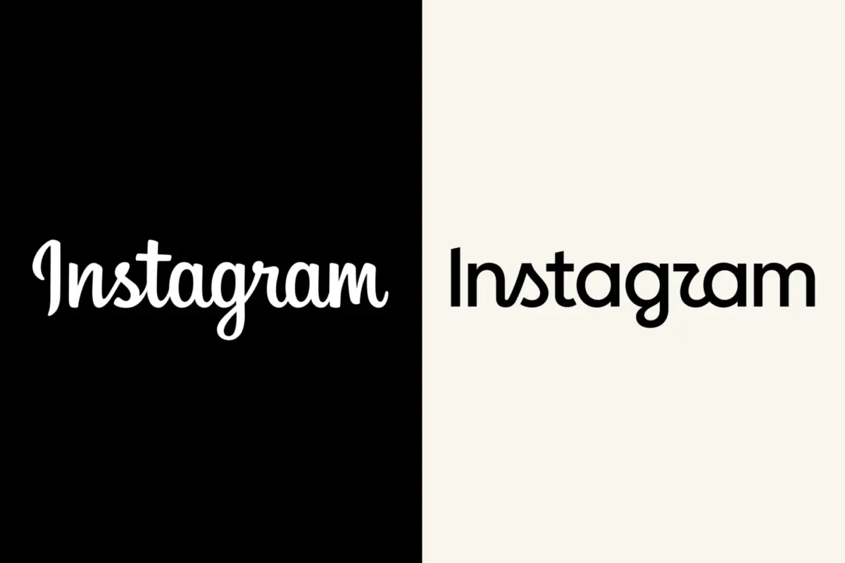
In the fast-paced ecosystem of digital technology, few visual identities are as universally recognized as Instagram’s gradient camera icon and its accompanying cursive wordmark. For a decade, the platform’s aesthetic remained a steadfast constant, anchoring billions of users across the globe through successive waves of algorithmic shifts, feature introductions—such as Stories, Reels, and Threads—and the broader corporate consolidation under its parent company, Meta. However, ten years in the digital realm is an eternity. Recognizing the necessity of evolution, Instagram rolled out a comprehensive brand refresh, introducing a modernized wordmark designed to project quiet confidence and creative maturity.
Yet, the rollout—unveiled on August 13—did not proceed without turbulence. Almost instantly upon debut, the updated typography drew sharp criticism, online mockery, and viral jests from users and corporate competitors alike. At the center of the controversy was a seemingly minor typographic choice: a cursive-style “s” in the updated wordmark that critics argued bore an unfortunate resemblance to the letter “z.” This ambiguity sparked a wave of internet humor, momentarily transforming the platform into the target of jokes about a hypothetical rebrand to "Instagzam."
Despite the initial turbulence, the minds behind the project remain steadfast. Jasmine Probst, Instagram’s director of product design and one of the principal leaders of the redesign initiative, sat down with Variety to unpack the philosophy, methodology, and creative conviction driving the change. Far from retreating in the face of widespread memes, Instagram’s leadership views the public reaction—even the satirical variety—as a testament to the community’s deep emotional investment in the platform.
This report delves deep into the anatomy of Instagram’s latest brand refresh, exploring the internal design process led by Probst and May Hartono, the balancing act between rigorous consumer research and creative intuition, the technological imperatives of a post-pandemic digital landscape, and what this high-stakes visual evolution signals for the future of the Meta brand ecosystem.
Detailed Chronology: From Concept to Public Backlash
To understand the current state of Instagram’s visual identity, one must first trace the timeline of its design evolution. For a decade, the previous wordmark served its purpose: it was friendly, approachable, and unmistakably tied to the early 2010s aesthetic of digital startup culture. However, as Instagram matured from a niche photo-sharing app into a sprawling multimedia juggernaut, the gap between its underlying technological sophistication and its legacy branding began to widen.
Planning for the refresh began months in advance, spearheaded by Jasmine Probst and May Hartono, Instagram’s director of brand design. Operating alongside a tight-knit core team of internal designers and cross-functional partners, the group sought to address a central question: How does a platform with over two billion active users update its visual signature without alienating the community that built it?
The design team utilized a modular, parallel-track approach, allowing different factions to iterate on distinct elements of the brand system while remaining unified through rigorous creative syncs. External agency partners were also brought into the fold to provide fresh perspectives, and the team conducted multiple rounds of external feedback gathering.
On August 13, the fruits of this labor were officially deployed to the public. The update featured a simpler, bolder wordmark engineered to function seamlessly across an expanding array of digital touchpoints—from high-resolution mobile displays and smartwatches to massive physical billboard advertisements.
However, the public reception was swift and, in some corners, unforgiving. Within hours of the launch, social media platforms—ironically including Instagram itself—were flooded with critiques. The primary lightning rod for the backlash was the new lowercase cursive "s." Due to its specific terminal loops and slant, users complained that it read poorly at smaller scales, frequently misconstrued as a "z."
Brands and meme pages quickly capitalized on the confusion. Parody accounts posted mock announcements welcoming users to "Instagzam," while users shared side-by-side comparisons highlighting the legibility hurdle. Rather than sliding under the radar, the typographic tweak became a trending topic, proving once again that internet culture watches the design choices of tech giants with microscopic scrutiny.
Supporting Context & Metrics: Why Change a Decade-Old Brand?
To contextualize why Instagram risked public friction for a typographical update, one must examine the broader metrics of the platform and the shifting demands of modern UI/UX design. Ten years ago, when Instagram last overhauled its core branding, the mobile landscape was fundamentally different. Screen resolutions were lower, app interfaces were skeuomorphic or transitioning toward early flat design, and Instagram was primarily a square-format photo gallery.
Today, the platform is a complex multimedia ecosystem. Users consume content across vastly different viewports, ranging from ultra-high-definition foldable smartphones to compressed thumbnail grids and desktop browsers. In this hyper-fragmented environment, delicate, intricate letterforms often fail to scale effectively, losing their fidelity and visual punch.
According to design experts within Meta, modern brand marks require three essential qualities:
- Scalability: The ability to remain crisp and instantly recognizable at favicon size or on massive outdoor displays.
- Timelessness: Moving away from hyper-trendy design motifs toward refined simplicity.
- Ecosystem Harmony: Coexisting comfortably within a broader parent-brand family without losing individual character.
Furthermore, the emotional resonance of a brand must evolve alongside its audience. The original Instagram demographic has aged, and a new generation of digital natives has taken the reins of platform culture. Probst and her team identified that the brand needed to project what they describe as "quiet confidence"—a departure from the loud, whimsical styling of the early 2010s tech boom toward something more grounded, authoritative, and mature.
Yet, corporate redesigns in the tech sector almost universally invite friction. When companies like Meta, X (formerly Twitter), Airbnb, or Slack alter their visual identities, users frequently experience a psychological phenomenon known as "design aversion"—a sudden, protective resistance to change regarding familiar digital environments. Instagram’s team was well aware of this human tendency, factoring both psychological resistance and genuine constructive critique into their long-term rollout strategy.
Official Statements & Design Philosophy
During her exclusive interview with Variety, Jasmine Probst provided rare, transparent insight into the corporate mindset and creative ethos that guided the project. Rather than viewing the public reaction through a defensive lens, Probst embraced the dialogue, offering a diplomatic and thoughtful defense of the team’s creative choices.
When asked about the timing of the refresh, Probst emphasized the sheer magnitude of change the platform has undergone over the past ten years.
"It’s been 10 years, and the platform has evolved enormously — it was time for a refresh," Probst told Variety. "The new mark moves us forward while keeping the same warmth and familiarity people love."
Addressing the stylistic adjustments made to the wordmark, Probst noted that the directive was to forge a visual identity that was simultaneously simpler, bolder, and yet retained a tactile, human quality.
"Our goal was to create something that felt familiar to Instagram, but sharper and more modern — to meet the community where they are now," she explained, adding that the overarching philosophy boils down to a delicate synthesis of eras: "It’s important for us to embrace the future, while remembering our values."
When direct inquiries were made regarding the widespread internet jokes concerning the "Instagzam" typo and the readability of the cursive "s," Probst maintained a notably positive posture. Rather than dismissing the critics, she celebrated the cultural footprint of the brand:
"We’ve truly enjoyed seeing the response from people and other brands — whether it’s memes, someone updating their wordmark to connect with ours, or user reactions. We’re proud of our work here and glad it’s out in the world."
Balancing data-driven user research with artistic vision is one of the most difficult tightrope walks in corporate design. Probst acknowledged that while external feedback was gathered through multiple structured rounds—noting that the team "very much take[s] input to heart"—design cannot be entirely dictated by committee.
"It’s also important to balance research with creative conviction, and the feedback helped us build clarity in the choices we made," she stated.
Delving deeper into the psychological attributes the team aimed to imbue within the new logo, Probst highlighted three core pillars: creative expression, quiet confidence, and the warmth of something crafted with care.
The collaborative structure behind the scenes was equally intentional. Alongside May Hartono, the project relied on a nimble core team of internal designers working hand-in-hand with cross-functional partners and external agencies.
"Our setup gave us flexibility to have different design teams driving different parts of the work in parallel, while staying in lockstep creatively, which is pretty special," Probst noted, highlighting the extensive web of consulted stakeholders and approving partners involved in the pipeline.
Finally, addressing speculation regarding whether the redesign was an effort to harmonize Instagram’s typography with the sleek, sans-serif aesthetic of the Meta and Facebook wordmarks, Probst clarified the strategic relationship between the parent company and its individual properties. While the overarching Meta brand family strives for visual cohesion, the impetus for Instagram’s refresh was rooted entirely in its own vibrant community.
"Across Meta, the wordmarks all aim to reflect both individual apps, and work comfortably as a larger brand family," Probst explained. "The Instagram refresh was focused on the Instagram community, and fits well in concert with the broader Meta ethos."
Future Outlook: What’s Next for Instagram’s Visual Identity?
As the initial shockwave of internet memes begins to subside, Instagram’s latest brand evolution offers a compelling case study in modern corporate identity management. The platform has successfully signaled its transition into a mature, highly scalable digital institution, even if it had to weather a brief storm of satirical pushback to get there.
Looking ahead, the longevity of this new wordmark will depend heavily on how gracefully it adapts to emerging technological frontiers. As spatial computing, augmented reality (AR) interfaces, and AI-driven curation increasingly dominate the digital horizon, static brand marks will face entirely new stress tests. A logo that reads clearly on a smartphone screen today must eventually maintain its integrity within immersive 3D environments and generative UI frameworks tomorrow.
Furthermore, Instagram’s handling of the "Instagzam" controversy highlights a modern paradigm shift in corporate communications. In the past, companies subjected to viral internet mockery would frequently issue defensive PR statements or hastily alter their assets. Today, sophisticated tech brands recognize that online engagement—even when expressed through satire—is a powerful form of brand retention. By leaning into the cultural conversation with grace, humor, and unwavering creative conviction, Instagram has reaffirmed its cultural relevance.
Ultimately, the 2026 brand refresh marks a definitive chapter in Instagram’s history. It honors the nostalgic warmth of its early days while equipping the platform with the sharp, modern edge required to navigate the next decade of digital evolution. Whether users eventually stop joking about the letter "s" remains to be seen, but one fact is certain: Instagram has ensured that, for better or worse, all eyes remain firmly fixed on its brand.