







Executive Overview
In the fast-paced ecosystem of modern digital commerce, the battle for consumer conversion is frequently won or lost in milliseconds of cognitive hesitation. According to foundational principles of user-interface (UI) design popularized by usability expert Steve Krug in his seminal work, Don’t Make Me Think, every mental speed bump a shopper encounters online actively erodes their intent to purchase. Questions such as "Where do I click?" or "What does this exact quantity mean?" force users to decode website architecture rather than focus on product value.
Krug often describes a shopper’s patience as a finite reservoir of goodwill. Each unneeded micro-decision—whether it involves calculating unit prices, deciphering ambiguous packaging tiers, or converting grams into daily portions—drains that reservoir. When the goodwill is exhausted, the browser simply abandons the cart and moves to a competitor.
While much has been written about reducing friction at checkout or lowering shipping costs, forward-thinking direct-to-consumer (DTC) brands are now attacking cognitive friction much earlier in the buyer’s journey: right on the product page. By leaning into intuitive cues, outcome-based naming conventions, and real-world visualization, companies like Gush, Waju, Blueland, and The Farmer’s Dog are eliminating the math from online shopping. This report investigates how these brands are redefining product page UX, the underlying cognitive science driving these design choices, and what the future holds for frictionless commerce.
Detailed Chronology: The Evolution of E-Commerce Usability
To understand how modern e-commerce product pages reached this hyper-optimized state, it is helpful to trace the evolution of web design over the past three decades.

Phase 1: The Digital Catalog Era (Late 1990s – Early 2000s)
In the early days of online retail, websites largely mirrored physical mail-order catalogs. Product pages were text-heavy, static repositories of information. Usability was an afterthought; the primary goal was simply getting product catalogs onto the internet. Shoppers were expected to do heavy mental lifting—comparing specs, calculating quantities manually, and navigating confusing taxonomies.
Phase 2: The Conversion Rate Optimization (CRO) Boom (2010s)
As e-commerce matured, the discipline of Conversion Rate Optimization emerged. Brands began obsessing over button colors, checkout funnel steps, and form fields. However, the focus remained heavily skewed toward the transactional tail-end of the user journey. Product pages were still treated as static spec sheets, leaving pre-purchase cognitive friction largely unaddressed.
Phase 3: The DTC Contextual UX Revolution (Present Day)
Today, digitally native vertical brands (DNVBs) operate in an environment of unprecedented customer acquisition costs (CAC) and fierce competition. Driving traffic to a site is no longer enough; every visit must be frictionless from the second a user lands on a product page. Brands have realized that reducing cognitive load—specifically around pricing, portions, and pack sizes—is a vital lever for boosting conversion rates. Rather than forcing users to think, modern UI/UX design anticipates user intent and handles the calculations automatically.
Supporting Context & Metrics: The Anatomy of Cognitive Friction
Cognitive load theory, originally rooted in educational psychology, has profound implications for digital user experience. When human working memory is overloaded with extraneous information—such as trying to figure out if a "12-pack" of juice pouches is enough for a weekend gathering or a single afternoon—decision paralysis sets in.
[Shopper Lands on Product Page]
       │
       ▼
[Ambiguous Quantities / Complex Math Required]
       │
       ▼
[Working Memory Overloaded (Cognitive Friction)]
       │
       ▼
[Reservoir of Goodwill Drains]
       │
       ▼
[Cart Abandonment / Bounce]
Case Studies in Frictionless Design
To combat this drop-off, innovative brands are deploying four primary design strategies that remove math and guesswork from the shopping experience:
1. Occasion-Based Labeling (Gush)
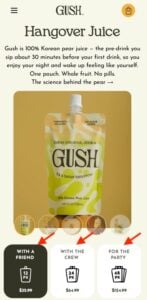
Beverage brand Gush recognized that shoppers buying juice pouches often struggle to translate raw unit counts into real-world utility. Instead of relying solely on traditional quantities like "12-pack," "24-pack," and "48-pack," Gush labels its pack sizes by social scenarios: "With a Friend," "With the Crew," and "For the Party."
- The UX Impact: The occasion does the math for the consumer. Rather than pausing to calculate how many pouches are needed for an upcoming social gathering, the shopper matches the product tier to their immediate plans, dramatically shortening the path to purchase.
2. Explicit Structural Clarification (Waju)
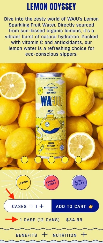
When selling beverages in bulk, ambiguity often arises around whether a listed price or quantity refers to individual cans or entire cases. Sparkling water brand Waju addresses this directly on its product page.
- The UX Impact: Waju pairs its quantity selector—clearly labeled "Cases"—with a direct explanatory text line reading: "1 case (12 cans), $34.99." Set against a high-contrast white input field background, this extra layer of transparency eliminates any lingering customer fear of accidentally buying the wrong amount.
3. Outcome-Based Naming Conventions (Blueland)
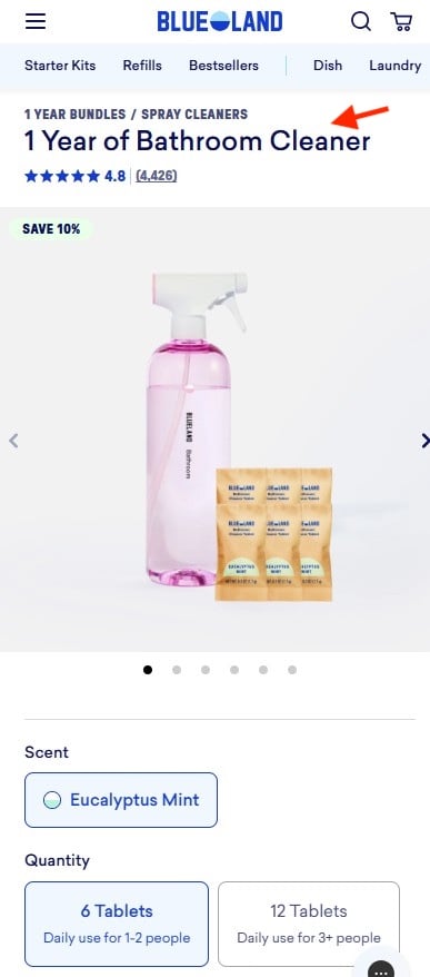
Eco-friendly cleaning brand Blueland tackles the complexity of refillable household tablets by shifting the focus from contents to outcomes. Instead of labeling a SKU by the exact number of solid tablets included in the box, Blueland uses outcome-driven product titles such as "1 Year of Bathroom Cleaner."
- The UX Impact: By framing the purchase around a timeline and a lifestyle outcome, Blueland bridges the gap between abstract product specifications and consumer reality. Shoppers immediately understand the long-term value and utility of what they are buying without having to mentally parse tablet-to-spray conversion ratios.
4. Visual Portioning and Daily Cost Framing (The Farmer’s Dog)
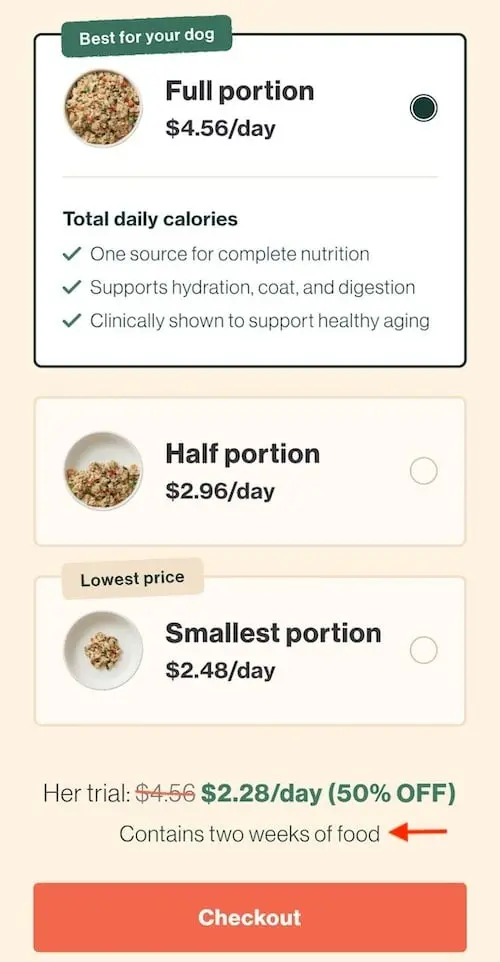
Subscription pet food service The Farmer’s Dog faces a complex mental math challenge: translating raw ounces of fresh dog food into feeding schedules, trial sizes, and long-term financial commitments.
- The UX Impact: The brand solves this by presenting three distinct, highly visual bowl sizes (full, half, and smallest portion) to illustrate food quantities intuitively. Furthermore, prices are framed per day rather than per box, aligning perfectly with how pet owners naturally budget for their animals. A concise explanatory subtitle below the selector ("Contains two weeks of food") locks in absolute clarity, ensuring shoppers never have to manually convert grams, boxes, or totals.
Official Statements & Industry Expert Perspectives
Industry analysts and usability authorities continue to emphasize that reducing mental friction is no longer optional for e-commerce survival.
"When visitors arrive at your site, every question you force them to answer—even minor ones about pack sizes or units—drains their mental energy," notes digital experience strategist Dr. Elena Vance. "The brands winning today are those that act as digital concierges, anticipating confusion and eliminating it before the customer even realizes they have a question."
UX researchers point out that mobile commerce (m-commerce) has amplified this need. With smaller screen real estate and higher distraction rates, mobile users have even less patience for ambiguous typography or complex pricing models.
"On mobile devices, cognitive load is magnified," explains UI architect Marcus Thorne. "If a user has to pinch, zoom, or do math in their head while looking at a product page on a smartphone, you have already lost them. Clarity is the ultimate conversion tool."
Future Outlook: The Next Generation of Frictionless E-Commerce
As artificial intelligence, machine learning, and advanced UI frameworks continue to evolve, the standard for frictionless shopping will only rise. Looking ahead over the next five to ten years, several key trends are poised to dominate the e-commerce landscape:
- Hyper-Personalized Cognitive Adaptation: Future product pages will dynamically adjust their complexity based on user behavior. Returning, highly familiar customers might see streamlined, minimalist options, while first-time visitors will encounter rich, visual hand-holding tools—such as dynamic portion calculators and instant size-matching guides.
- Generative UI and Conversational Clarity: Static product pages will increasingly give way to modular, generative layouts that answer specific buyer questions in real-time. If a user hesitates over a quantity, conversational micro-prompts or visual aids will instantly render to clear up the confusion.
- The Death of Manual Math: As more direct-to-consumer brands adopt outcome-based naming and visual portioning, consumer expectations will shift permanently. Manual unit calculations will become a hallmark of poor design, and brands that fail to automate clarity for their buyers will see their conversion rates plummet.
Ultimately, Steve Krug’s foundational rule remains truer than ever: Don’t Make Me Think. E-commerce brands that master the art of silent, invisible guidance—ensuring that every price, pack size, and portion is instantly understood at a glance—will secure not only the transaction, but the long-term loyalty of their customers.